By PackBoxes – UK’s Trusted Packaging Partner
Design plays a powerful role in how customers see your brand. Whether it’s your logo, website, social media creatives, or especially your product packaging, the design must follow solid principles to attract attention and communicate quality. In the UK market—where brands compete fiercely for visibility—understanding the seven basic principles of design will help you create packaging that stands out, sells more, and strengthens customer trust.
If your business is looking to elevate its branding through , eye-catching, and high-quality packaging, understanding these principles is the first step. This guide explains each design principle in detail and why they matter, especially if you’re using Custom Printed Packaging in UK solutions to enhance your brand presence.
Why Design Principles Matter for Packaging
Packaging is often the first physical interaction a customer has with your product. Good packaging design:
- Shows your brand’s quality
- Makes your product stand out on shelves
- Creates emotional connection
- Builds recognition
- Influences buying decisions
Brands across the UK—from beauty to food, CBD products, perfumes, and retail—use design principles to craft packaging that leaves a lasting impact. Even businesses using Custom Printed Packaging in UK rely on these seven core principles to ensure consistency, appeal, and professionalism.
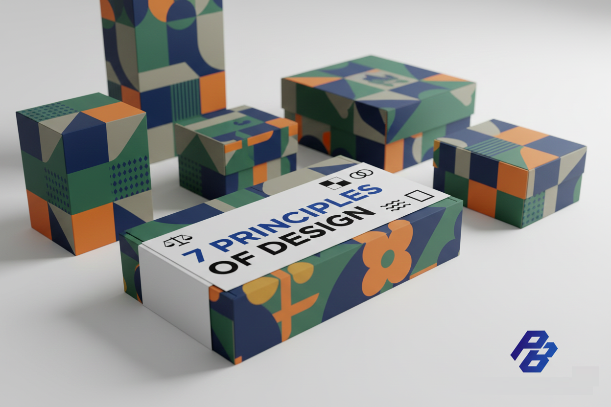
The 7 Basic Principles of Design
Below are the seven most important design principles every brand should consider, especially when developing packaging.
1. Balance
Balance refers to distributing visual weight evenly. It ensures the design looks stable, neat, and visually calm.
Types of Balance
- Symmetrical Balance — both sides mirror each other
- Asymmetrical Balance — different elements are arranged in a way that still feels balanced
- Radial Balance — elements radiate from a center point
Why It Matters for Packaging
When your packaging is balanced:
- It feels premium
- It becomes easier to read
- Customers feel more trust in the brand
For example, perfume packaging often uses symmetrical balance to show elegance, while modern brands may use asymmetry to appear trendy.
2. Contrast
Contrast helps important elements stand out. It involves using different colors, shapes, fonts, and sizes to create highlights and guide the viewer’s eyes.
Forms of Contrast
- Dark vs. light colors
- Thick vs. thin fonts
- Bold graphics vs. minimal text
Why It Matters for Packaging
Contrast can:
- Highlight your brand name
- Make your logo more visible
- Improve readability
In UK retail stores, products with high contrast packaging often catch customer attention more effectively.
3. Emphasis
This principle focuses on creating a focal point—something the viewer must notice first.
Examples of Emphasis
- A bold logo
- A highlighted offer
- A product benefit (“100% Organic”)
Why It Matters for Packaging
Emphasis:
- Helps customers understand your product quickly
- Strengthens brand identity
- Increases shelf visibility
Good packaging always has one strong focal element.
4. Movement
Movement refers to how the eye travels across the design. A good design guides the viewer naturally from one part to another.
Tools for Movement
- Arrows
- Lines
- Shapes
- Repetition
- Gradients
Why It Matters for Packaging
Movement ensures that customers:
- First see your logo
- Then read product details
- Then understand the features
Every successful packaging design uses movement to control visual flow.
5. Rhythm
Rhythm is created when elements repeat in a pattern. It gives the design a sense of harmony and consistency.
How to Create Rhythm
- Repeated brand colors
- Repeated icons or patterns
- Consistent typography
Why It Matters for Packaging
Consumers love packaging that feels organized and familiar. Rhythm builds:
- Brand recognition
- Visual impact
- Professional appearance
Brands in the UK that use repeated patterns on boxes often look more premium.
6. Unity
Unity ties all elements together so the design feels complete and purposeful.
How to Create Unity
- Use consistent colors and fonts
- Match design style with brand identity
- Ensure all elements support the main message
Why It Matters for Packaging
Unity makes your packaging:
- Look professional
- Appear consistent
- Feel aligned with your brand’s personality
From luxury packaging to eco-friendly boxes, unity is crucial to maintaining brand trust.
7. Space
Also called “negative space,” this principle involves the empty areas around design elements.
Why Space Is Important
- Improves readability
- Prevents clutter
- Highlights important elements
- Gives the design a clean, modern feel
Brands that overwhelm their packaging with text or graphics often look outdated. Using space wisely makes your packaging feel premium—an essential factor in UK markets.
How These Principles Apply to Packaging Design
When all seven principles blend together, the result is packaging that is:
✔ Visually appealing
✔ Easy to understand
✔ Memorable
✔ Consistent with branding
✔ High-converting
Brands that invest in Custom Printed Packaging in UK always benefit from applying these seven principles because they create a strong, professional identity that boosts sales.
Why UK Businesses Prefer Custom Printed Packaging
The UK market is heavily competitive. Using custom packaging offers advantages such as:
- Brand recognition
- Increased retail shelf visibility
- Better customer experience
- Professional presentation
- Eco-friendly options available
- Endless customization possibilities
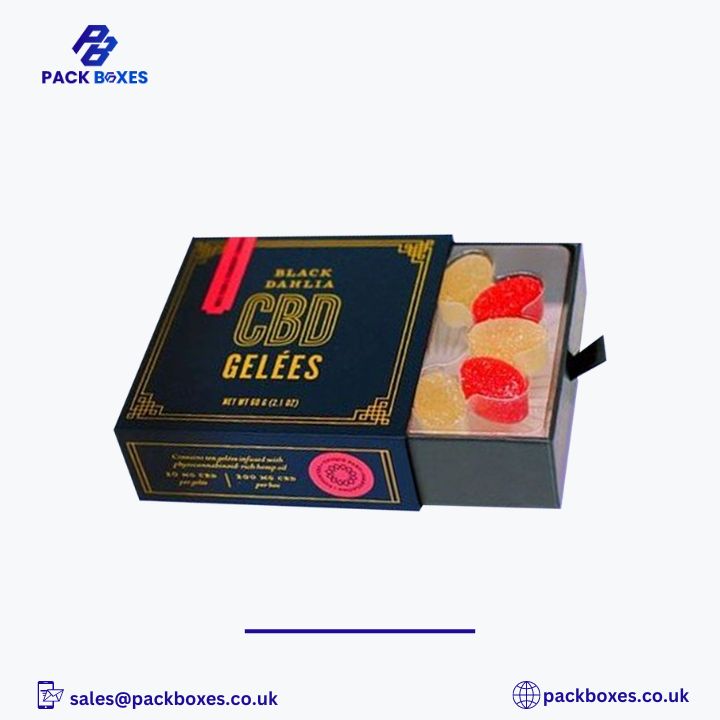
From cosmetics to food to CBD, businesses in the UK trust PackBoxes for premium, cost-effective packaging solutions.
Why Choose PackBoxes?
PackBoxes provides top-quality packaging solutions all over the UK. Whether you need:
- Custom cosmetic boxes
- CBD packaging
- Food packaging
- Retail boxes
- Luxury rigid boxes
…we deliver premium-grade printing, durable materials, and stunning designs that follow the seven principles discussed above.
Our team ensures that your Custom Printed Packaging in UK reflects your brand identity perfectly while helping you stand out in the competitive market.
10 FAQs About the 7 Principles of Design
1. What Are the Seven Principles of Design in Simple Words?
The seven principles of design are balance, contrast, emphasis, movement, rhythm, unity, and space. They help create visually appealing, readable, and professional designs.
2. Why Are Design Principles Important for Packaging?
They make packaging attractive, easy to understand, and memorable. This increases customer trust and boosts product sales.
3. Which Is the Most Important Design Principle?
All are important, but balance and contrast are usually the most crucial for packaging.
4. Do These Principles Apply Only to Packaging?
No, they apply to graphic design, branding, web design, marketing materials, and more.
5. How Does Contrast Improve Packaging Design?
Contrast highlights key elements, improves readability, and grabs customer attention.
6. What Does Emphasis Mean in Design?
Emphasis creates a focal point—something that the viewer notices first, like a logo or tagline.
7. What Is Unity in Design?
Unity ensures all parts of the design work together harmoniously to deliver one cohesive message.
8. Is Space Important in Packaging Design?
Yes! Space prevents clutter, enhances readability, and gives packaging a clean, premium feel.
9. Can Small Businesses Benefit From Good Packaging Design?
Absolutely. Good packaging helps small brands compete with bigger names and leaves a strong impression.
10. Who Can Help Me Create Packaging Based on These Principles?
PackBoxes offers expert design and printing services across the UK. Our team creates packaging that follows all seven design principles for maximum impact.
Final Words
Understanding the seven basic principles of design helps brands create visually stunning, functional, and high-impact packaging. Whether you’re launching a new product or upgrading your existing packaging, these principles ensure your design looks professional and connects with customers.